200+ people came to the event with help from this campaign…


Final version
Client
Centre 56
Service
Design
Year
2022
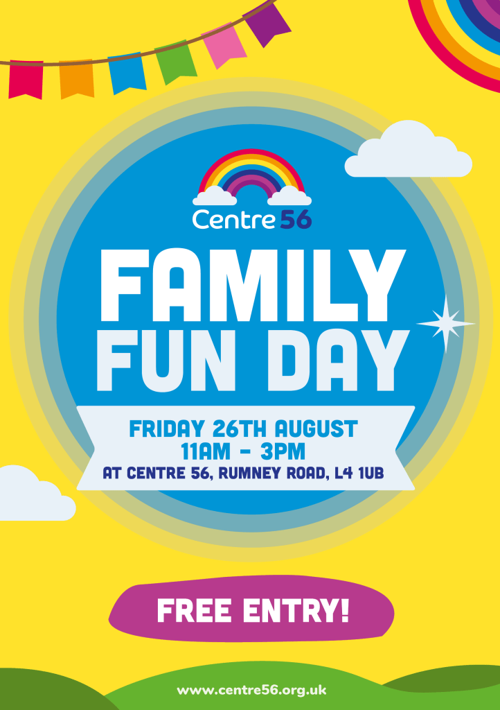
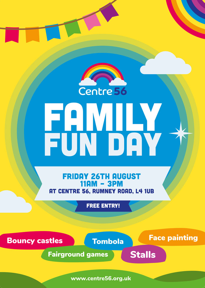
Centre 56 is a domestic abuse nursery, supporting families who have experienced abuse or who are in crisis.
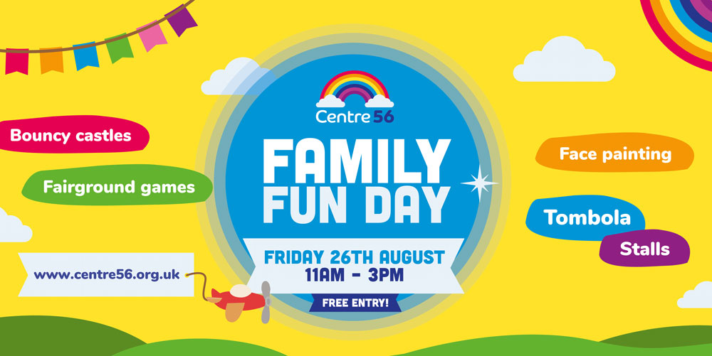
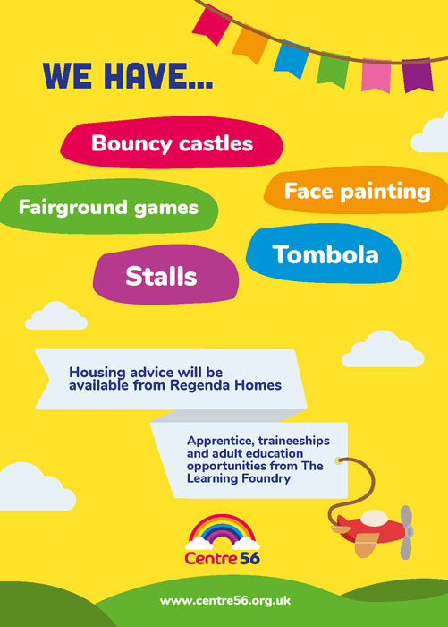
The brief – To create a suite of materials, including flyers to large format banners, to market a family fun day event where people could go for housing advice, training opportunities as well as just a good time!
The concept – Centre 56 is a very bright, colourful and playful brand, so the idea was to emulate that playfulness and a safe environment for all to come and enjoy the day.
The outcome – The initial draft of this flyer was quite bland and boring, not what Centre 56 wanted to be at all. Previously their website was quite outdated so going off the website and previous designs lead to a rather dull project. To liven this up I added more variation of colours and odd shapes to liven up and make the message pop! The header font (Nunito) for Centre 56 didn’t stand out enough, I decided to use an alternative font and use Nunito as a secondary font. While doing this I also reviews the content for the print materials, as it was quite long and wordy when it didn’t need to be. Putting myself in the target audiences position, I’m not going to look at a flyer or a poster very long, I would want to absorb key information quickly. To make the most impact I edited down the content into understandable bullet points for quick and easy readability as well as keeping in line with the light feel that the brand has.
I worked through multiple variations and style type before I came up with the final design. Bringing the logo’s rainbow and colours really added that pop, whereas previous designs stuck with yellow and blue as one of the few colours they used. This event turned out over 200 people and was a big success for Centre 56, this design also lead to more fun and playful designs in future and on the website.
The design process – I knew I wanted something bright and bold when creating this suite of materials, my initial draft wasn’t where I wanted it at all. I tried to work with previous assets and colours that were used however it wasn’t working at all. I decided to scrap my first design and look for inspiration, trying something completely new for Centre 56.
to overcome this initial problem I decided to use bolder header fonts, more colours and to make a scene; a short preview of what the fun day could look like. Having the fading circle focal point and fading outwards shows the hierarchy of information and leads the viewers eyes in the right direction.
Version 2 initial design idea
Final suite of materials, including banners, email PDF’s, flyers and a poster

Comparison of old vs new branding
Tools used:


